- Work
- MicrosoftProduct design work to increase feature adoption within web app
- Port 99UX/UI for end-to-end product design on B2B2C web application
- BP - Password ProtectedEnd-to-end Product Design work for internal enterprise applications
- UltrafloWeb design and development work and maintenance
- GorhamFront and backend development work for custom WordPress website
- AccentureUX/UI design for custom website landing page
- About
- Resume
- Contact
Port 99
-
IndustryOil & Gas
-
ProjectWebsite Application
-
ToolsAdobe XD, Photoshop, Illustrator, UsabilityHub.com, Bloomreach
-
RoleUX/UI Design Lead
-
Team
Project Manager, Project Owner, Scrum Master, Change Management, Business Analysts, Architecture, Design, Development, Quality Assurance
Our team was designated to build an application that enabled a 360° view of the customer for internal users. External users are able to enroll as new customers, place orders, access order related documents and manage users.
Project Brief
-
What problem are we solving?Users are unable to select multiple companies. After selection, users are unable to identify and confirm that a selection has been applied.
-
What value are we providing our customers?Customers are able to see and analyze data for multiple companies in a single view. Internal users are also able to utilize this feature. Their access level allows them to see all of the companies with whom we do business, increasing the value because they are able to analyze data between different companies as well.
Design System
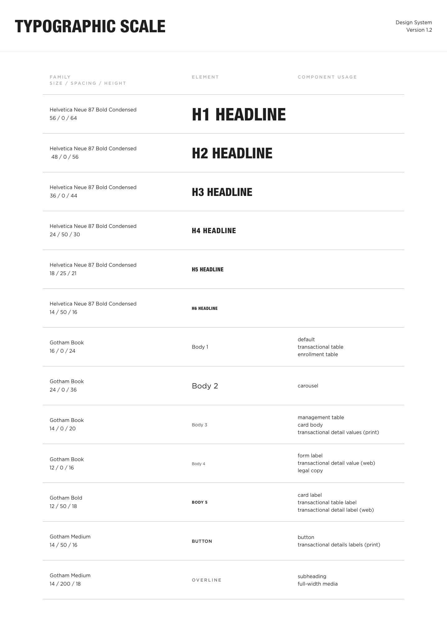
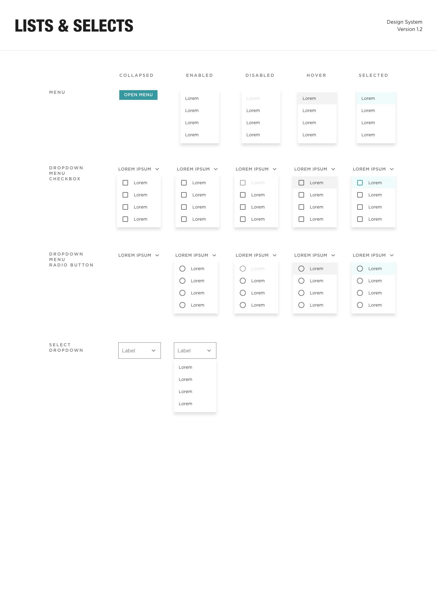
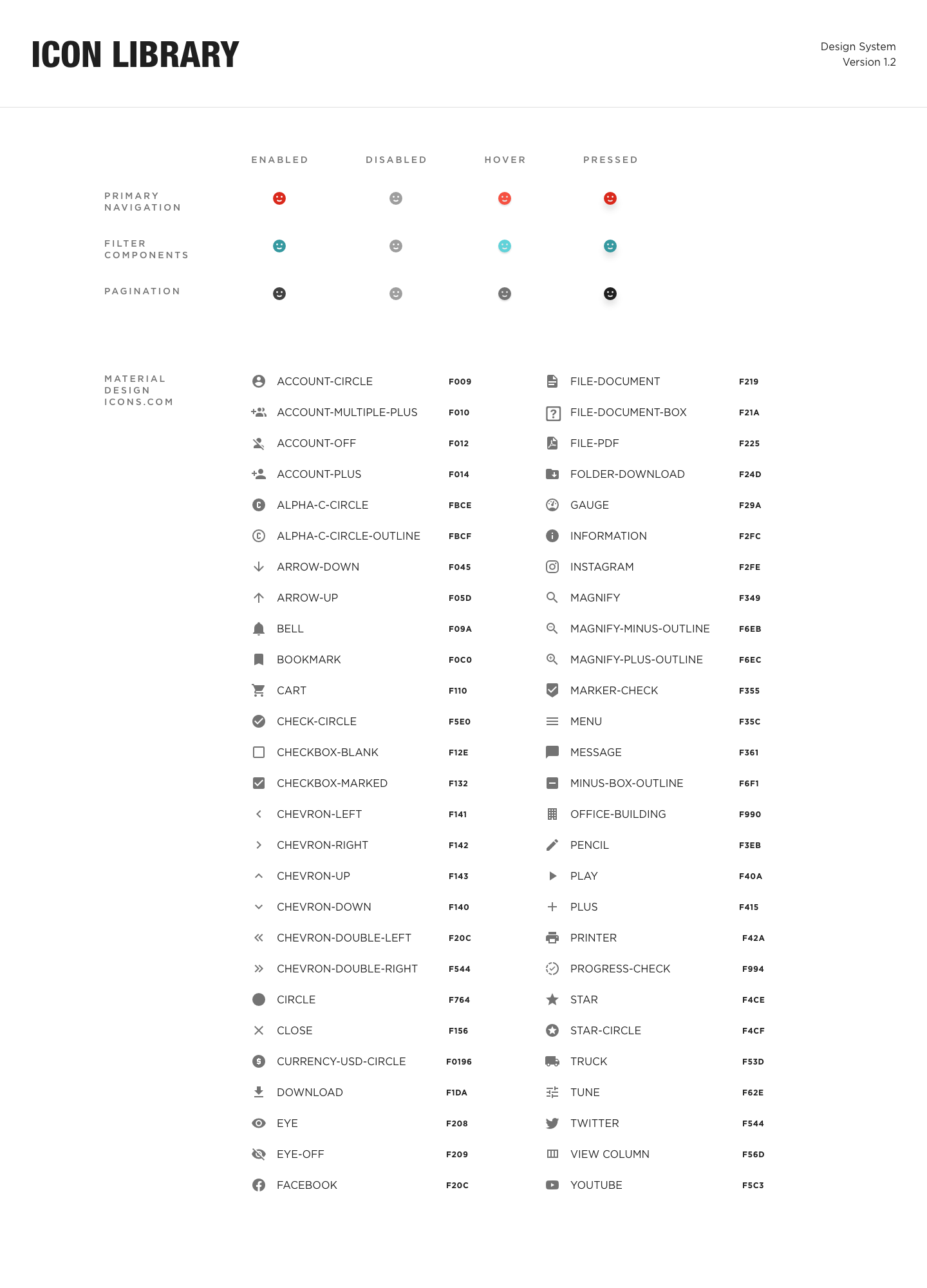
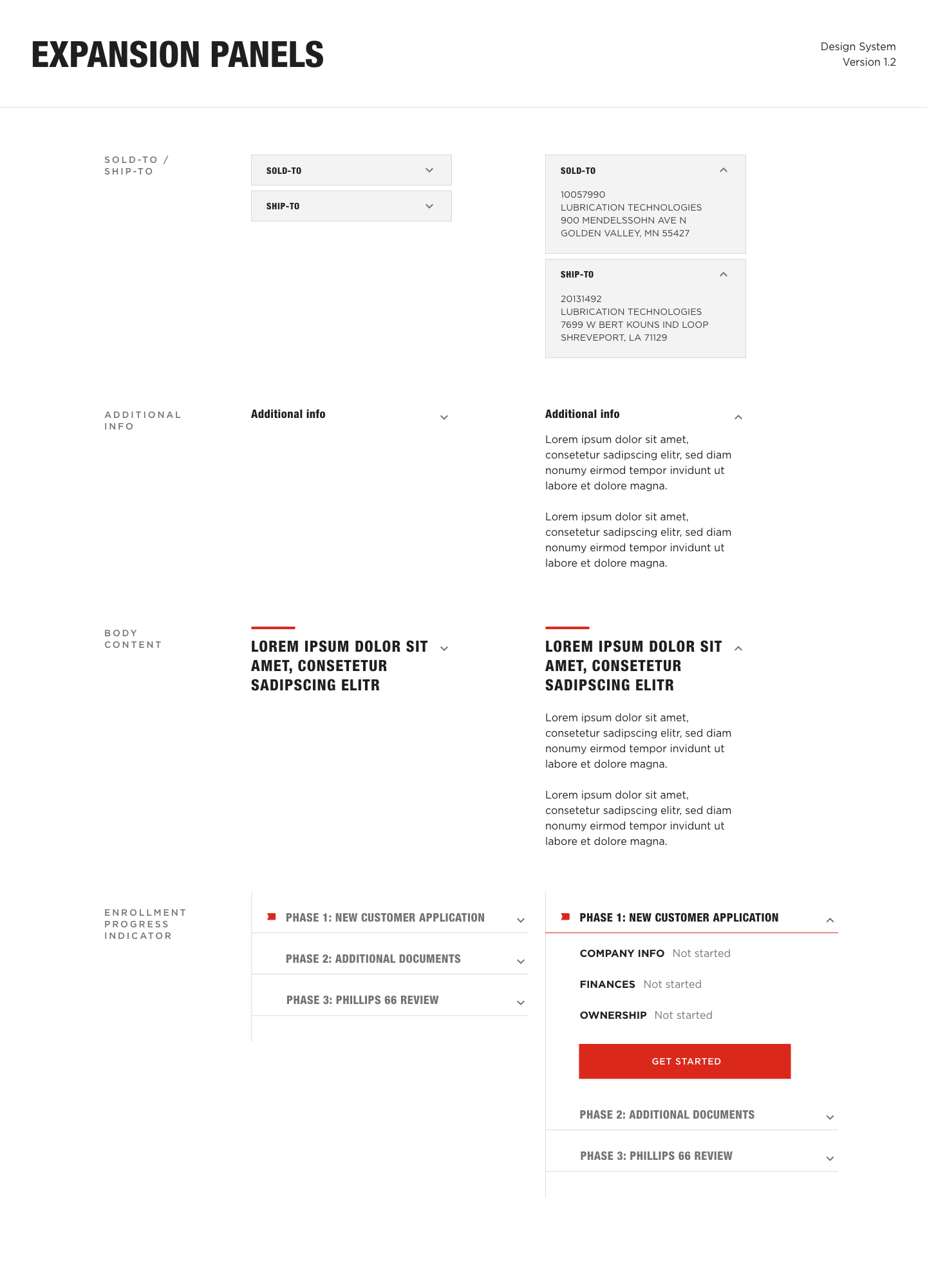
The application framework was built on Material Design + React. I created the design system to utilize Material Components that were then customized to align with the company’s branding guidelines. Wireframes, mockups and prototypes were completed with Adobe XD.
Custom components that were specific to application needs were also created:
- Company Selector (Sold-to Picker)
- Expand/Collapse Order Row
- Expand/Collapse Order Card
- Product Cards
Research
Design thinking exercises like empathy mapping, how might we and card sorting were used to evaluate user needs and discover new opportunities. I conducted over 100 user interviews and (aggregated, consolidated and extracted) dialogue to create empathy maps and provide useful solutions for how might we exercises.
Because each product has a specific makeup and is utilized in specific applications, I needed to ensure that all of the relevant data was displayed and easy to access. Each business unit underwent card sorting exercises to determine which product related data would be displayed and what needed to be updated and/or removed.
I also assisted BAs with data mapping exercises that would ensure any old references to the data were updated in the new system. This gave BUs an opportunity to clean house and get rid of any outdated data that was no longer used.

Analysis
This component was initially named “sold-to picker”. It allowed users with multiple sold-tos to select which sold-to they wanted to view and then proceed to access its associated data. Sold-to is a term used internally because our customers have companies that they “sell-to”. Because content also varies between the business units that are associated with each sold-to, this component is also useful on content pages. If a user purchases one product from Business Unit A and another from Business Unit B, they can toggle between the data and content associated with each product.
First, I defined the requirements: visible sold-to name, visible sold-to number and global accessibility. Next, I added additional features for ease of use: ability to search by name, search by number and search with autocomplete capabilities. The mockups went through several iterations and were tested for usability. The data revealed that users were not familiar with the function and several users provided feedback that the icon was unrecognizable and it didn’t relate to the sold-to function.
Design
After the first release, I reevaluated the functionality to allow users to select multiple sold-tos. The requirements were similar to the single sold-to selection. I also wanted to improve on the components identity. I accomplished this by renaming the component to the “company selector”, visible as a tooltip when users hovered over the icon. Because customers were unfamiliar with the language of “sold-to picker”, the new name was more in line with the user’s objective. I also changed the icon to a “C” for better representation.
The functionality was also updated. This included swapping the radio buttons for check boxes to allow multiple selections. To increase visibility after a selection was made, the selection was displayed above the company list. This adjustment allowed users to deselect items quickly. The active selections were also listed in their original location, preventing any awkward jumping in the UI when a selection was made, this also provided an additional point of reference for the user’s active selection. An indicator was also added to the icon, allowing users to identify that their selection was applied while displaying the number of active selections.


Testing
The component’s usability was tested via UsabilityHub.com with unmoderated testing. Variation tests were created featuring both the old and new version of the component. The tests revealed that the updated component was easier to identify, met the multi-selection criteria and provided better ease of use.
